Summary/Abstract
There is an overwhelming amount of crime data available about Providence from 2006-2016. What can we learn about the city from this data? How do we gain a deeper understanding of crime trends around the city than just averages and statistics? We used machine learning techniques to break the data up over regions of the city, and explored police activity and crime in terms of these regions. We used a variety of mapping and visualization techniques to glean information from this enormous dataset. Theft is by far the most common crime in Providence, though this changes as a function of the time of day. Some sectors have very low crime in general, but see more crime relative to other areas of the city. Most areas of the city see theft as the most common crime all day, but other areas see violence as more common, especially at night.
Data
We used data from the Providence Police Department. We downloaded the data form http://data.providenceri.gov and also incoprated data recevieved directly from the department. The data consisted of 180,000 case reports that spanned 10 years (from 2006 to 2016). Fortunately, the original format of the data itself was quite clean so there was minimal work to be done in order to make it usable. However, we did remove duplicates and normalize the strings to remove special characters and lowercase. We also divided the different types of crime into 5 categories labeled as Violence, Substance Abuse (Alcohol/Drug), Sexual, and Unknown. The number of cases associated with each of these categories is as follows:
- Violence: 56852
- Theft: 110488
- Alcohol/Drug: 14553
- Sexual: 2163
- Unknown: 10
Each case had a number of fields associated with it. This includes location (a street address), time, date, reporting officer, statute, description, crime type, and crime code. With this data, we were able to make various visualizations and classifiers that we describe in detail in the following sections.
Questions/Hypothesis
We took a broad approach in terms of exploring this data set. We began by asking some general questions that would help us identify trends in Providence crimes. Some questions we asked initially were are crimes more likely to occur amongst people of a particular demographic (gender, age, race)? Are some types of crimes more likely than others in certain areas? Where is crime the most reported? Are certain officers more likely to arrest for certain crimes?
Our main hypothesis was that there would be a decrease in crime on the East Side, both because of less crime occurring and because of where policing efforts were concentrated. We also expected to see the most crime at night, and crime demographic statistics that were unrepresentative of the population of Providence.
Methodology
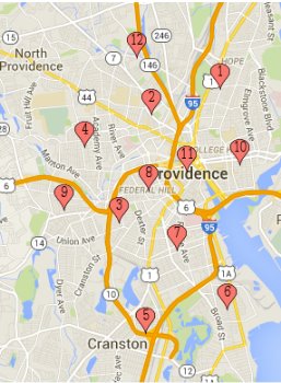
We downloaded the data into a csv file and then performed geocoding to find the latitude and longitude of where the crimes were reported as occurring using the provided physical address. We cleaned the dataset as described above and used an SQL database to store all the relevant information (including location, date, violation, officer). Furthermore, we performed k-means clustering to cluster where the crimes were occurring and then visualized the clusters on a map of Rhode Island. We used k-means to identify twelve different crime clusters around the city of Providence and surrounding areas. We then split the crimes into different crime subcategories: Theft, Violence, Drug/Alcohol related, Sexual crimes, and Unknown. We then built a classifier over the data with the SKLearn package in Python, and made vizualizations using D3 and leaflet.js. We used a Logistic Regression classifier to classify the type of crime, given a time of day and centroid location (based on the k-means clustering). Thus, our features were were time of day and centroid. The label would be one of the types of crimes. We used
from sklearn.cross_validation import train_test_splitto split our data into training and testing sets. We then used the logistic regression classifier with the multiple classification label flag on from sklearn to train and test our model.
Breaking up the data by cluster allowed us to find more interesting statistics about particular regions in Providence, and how certain types of crime distribute themselves around Providence. We built an interactive tool to browse crime type by location in the city which is available in our final web tool.
We also took a look at the data from the perspective of tracking officer activity throughout the day. We built a tool based on the responses of officers to crime in 2015, showing when and where the crimes they responded to occurred. This visualization is also available in the final web tool.
Results
K-Means
We were able to perform the k-means algorithm that we had tested with our initial sample of data (consisting of a few thousand points) with our entire set of data of over 184,000 datapoints. In order to do this, we finished sanitizing our data, converting all street names and intersections into latitude-longitude pairs using a geocoding api, and inserting all of the data into our database. When we ran the k-means algorithm with 20 iterations, we found 12 different clusters.

The data looked to be generally well-split among the different clusters:
- 1|10849
- 2|16350
- 3|16147
- 4|23071
- 5|4271
- 6|7440
- 7|26029
- 8|16470
- 9|14278
- 10|8418
- 11|29480
- 12|11258
Now that we have all of the datapoints assigned to clusters, we are planning to visualize the data more thoroughly, as we did in the midterm report, to show the trends of in what clusters crime occurs most. We can apply a lot of the existing visualization code we had previously here.
Arrest logs Demographic Information
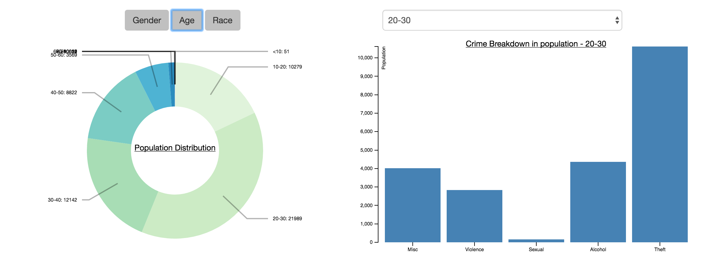
We did some work to understand the demographic information that the arrest logs provided us. We wrote an extensive python script to parse through each row in the arrest log csv and get demographic information. The arrest logs contained 90718 arrests, 57551 of which were unique. In general, we learnt a few things: the average age of arrestee was 30.26, 81% of arrestees were male, and that there is a disproportionate number of black arrestees. We learnt that the average age of arrestee was 30.26, with the following distribution of age groups:
- 0 - 10: 51
- 10 - 20: 10279
- 20 - 30: 21989
- 30 - 40: 12142
- 40 - 50: 8822
- 50 - 60: 3569
- 60 - 70: 620
- 70 - 80: 59
- 80 - 90: 12
- 90 - 100: 1
- 100+: 7

The population distribution in terms of age was interesting - there was a reasonable distribution across all the age groups. Ages 20-30 was the majority at 38% of the population, which is in line with common perception. It is unfortunate that there was also significant representation of ages 10-20 (18% of population). In terms of crime breakdown, theft is always the majority of crimes; ages 10-20 were relatively more likely to engage in violent crimes than older age groups; and alchol related crimes proportionally increased with age and peaked for ages 70-80.
We tried to identify the gender distribution of the arrestees:
{'Female': 10798, 'Male': 46701, 'Unknown': 52}

In the arrests of the years sampled, there were 46701 male arrestees and 10798 female arrestees. Assuming a roughly equal gender split in the Providence population, then the 81% male arrestee ratio is heavily skewed. However, this skew reflects traditional biases that males are more likely to commit crime/be arrested. Looking at the crime breakdown also shows that male arrestees were relatively more likely to commit alcohol or sexual related crimes than female arrestees.
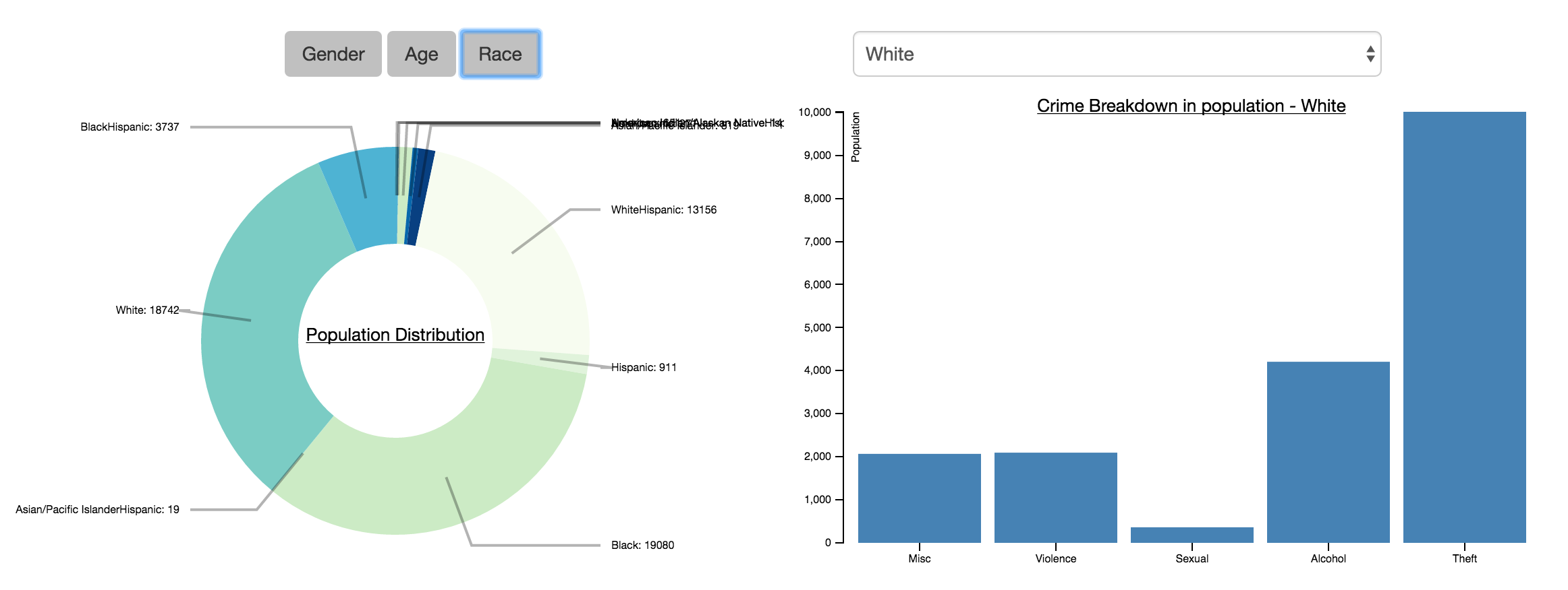
We then tried to identify a race and ethnicity distribution amongst the arrestees, as follows:

- 'American Indian/Alaskan Native': 141
- 'American Indian/Alaskan Native-Hispanic': 24
- 'Asian/Pacific Islander': 819
- 'Asian/Pacific Islander-Hispanic': 19
- 'Black': 19080
- 'Black-Hispanic': 3737
- 'Hispanic': 911
- 'NonHispanic': 271
- 'Unknown': 651
- 'White': 18742
- 'White-Hispanic': 13156
The race distribution shows that caucasian and African Americans were dominant in the arrestees, each accounting for around 1/3 of the arrestees. White-Hispanics was also a large proportion, accounting for 23% of arrestees. The remaining 10% of the population is made up of native Americans and asians. This distribution is very different from the census data where African Americans only account for 16% of Providence's population - this overproportion can potentially be attributed to socioeconomic or racial bias factors. There are no particularly discernible trends in the crime breakdown other than caucasians being more likely to commit alcohol related crimes than most other races. It is hard to determine trends for very small populations, ie "Asian/Pacific IslanderHispanic", as any identification would suffer from small sample bias.
These results are very interesting and shows how much information is embedded in this large log. One thing to note is that because many of the entries are manually entered by officers, there are often clerical errors in the logs or inconsistencies in how something is reported, which requires careful correction when we go through the dataset.
Machine Learning: Building a classifier
We began to implement our logistic regression for classification of type of crime. First, we went through our data set and categorized the various cases into one of five categories. We created a mapping from the offense and crime codes given in the csv to categories we thought were reasonable. For example, 09A is murder and nonnegligent manslaughter, which we put into violence.
Here is the mapping itself:
violence: 0
theft : 1
alcohol/drug : 2
sexual : 3
misc: 4
codes = {"290": 0, "23H":1, "23F":1, "13B":0,"35A":2, "240":1, "36B":3, "26A":1, "90D":2, "220":1,"520":0, "23C":1, "23D":1, "90J":1, "90C":1, "120":1, "13A":0, "280":1, "11A":3, "90F":1, "11D":3, "36A":3, "26B": 1, "90A":1, "90G":1, "90H":1, "13C":0, "23B":1, "250":1, "40B":3, "210":1, "370":3, "23A":1, "39B":1, "270":1, "26C":1, "200":0, "40A":3, "11B":3, "26D":1, "100":0, "09A":0, "11C":3, "90B":1, "64A":3, "26E":1, "64B":3, "90E":1, "09C":0, "35B":2, "23G":1, "BLA":4, "09B":0, "90I":1, "23E":1, "39A":1, "510":1}
With some python scripting, we were able to find how many types of crimes there were.
- Violence: 56852
- Theft: 110488
- Alcohol/Drug: 14553
- Sexual: 2163
- Unknown: 10
Using the sklearn packaing and logistic regression classifier methodology we have described above, we built a classifier to predict the likelihood of certain types of crimes occuring at a particular time in a particular centroid. However, during testing, the model is only about 60% accurate overall. The main issue seems to be that there are a lot more theft cases than anything else. In order to improve our classifier, it may be necessary to break down the thefts into more fine grained categories, or use a completely different approach - perhaps include more ensembling learning methods as well.
We also graphed the number of crimes versus the time of day to get:

Clearly, crime occurs the most at around 4PM. We then did a stacked column chart to which types of crimes occurred the most throughout the day:

It is also interesting to see the types of crime individually. Here, sexual crimes tend to occur later in the night. Substance crimes tend to occur late at night and early in the morning. There are more graphs available in the "trend" section of the webtool where we can also see that thefts occur during the day and less at night.


Finally, we plotted the centroids (from the k-means clustering) and found the following: Clearly, centroid 8 and 12 have a lot of theft.

Officer Visualization
We grouped all of the cases from 2015 by officer, and filtered out all officers with fewer than ten cases they responded to in 2015. We then used this data to make an interactive map, showing an officer’s activity during 2015. Cases earlier in 2015 are colored red, and later in 2015 are colored blue. Each case is connected by a line to the one that the officer responded to next. The visualization runs in a webpage using D3 and leaflet.js.

Officer Doucette responded to 161 cases in 2015, mostly in the downtown and northern areas of Providence.

Officer Kennedy alternates responses between the western edge of Providence, an area near Providence College, and Hope.

Contrast officer Kennedy’s activity with Hull’s,who spent much of his time responding to cases in the same three areas, but spent most of 2015 out around Atwells Avenue and only a smaller portion at the end on the East Side.

Officer Groot, on the other hand, handled 88 of his 93 cases in 2015 in the Downtown area.
Explain how much of your final project proposal you achieved. What worked and didn't work? What were interesting surprises?
We were able to accomplish many of our original goals. Our minimum plan had several parts, one of which was to make a tool that would produce summary information about the data looking at different groups of people involved in police cases. In our final project, we successfully made a tool where you could look at the frequency of certain categories of crimes, broken down by race, age, and gender (the “Demographics” page of our final website).
Additionally, in our original proposal, we were hoping to create an interactive map where you could visualize where different kinds of crime were occurring, and where crime occurs most. This happened in two ways. We ran the k-means clustering algorithm to create 12 clusters, and then visualized predictions for the probability that different kinds of crime would occur in that geographic area depending on the time of day (the “Predictions” section of our website). While this didn’t visually show all of the data points on the map, it answered the question of when and where certain kinds of crimes were relatively most likely to occur. We also plotted all of the data in a static map on the “Trends” section of the website, plotting the absolute frequency of crime in each centroid and showing the map so that the user could see where crime occurred most. Unfortunately, the sheer scope of data made the map too slow to render with all of the data points on the map when it was an interactive tool, so the static picture was the only option that were able to use. (We actually created the visualization and it is available in our tool as map.html but its speed makes it an ineffective visualization.) One of the most interesting finding with this plotting, though, was that there were entirely “crime-free” sections on Brown University’s, Providence College’s, and Rhode Island College’s campuses -- we believe that this is because each college or university has its own private police force, and so does not report crime through the PPD channels.
Between these visualizations, we were comfortable that we met our minimum requirements, allowed the user to interact with the information in an easy way, and additionally delved into some of the further ideas that we had for our project, such as a better analysis of crime type and time, and machine learning to predict where crime would occu.
Lastly, we were able to do some work on officer activity, though did not get as far into this set of data as we wanted to in our ideal proposal. On the “Officer” section of the website, the user can click different officers and see a trend of where their policing occurred throughout the city over time. With this, we were able to see how different officers policed different parts of the city, and how patterns changed throughout the year. One difficult aspect of this was differentiating between officers, since many have the same last names.
Future directions and exploration
One of the most interesting questions that we weren’t able to fully explore was how arrest and case statistics on the basis of race compare for specific officers and the areas that they are policing. Are certain officers arresting people of a certain race at statistics significantly higher than their colleagues, or at rates disproportionately high for the parts of the city that they are working in? Using census data about different districts in the city as a basis for comparison would be a great extension. We also would have likely to try to improve our crime classifier to include more features, so that we could predict crime statistics based not just on area and time of day, but also on time of year, so we could see how crime trends change in different seasons and on certain holidays.